« Bogie Thoughts


The Mitchell Hamline Homepage
The life of a homepage
Today, I look at the life of a homepage—that of my former employer Mitchell Hamline School of Law—in three parts. Its functional start; where I made it stronger after five years; and where from 2025 to 2026, instead of again getting needed adjustments to improve, it has suffered a radical regression and is no longer serving the vital function of a homepage.
This was the single page I invested more of my effort, institutional knowledge, and judgment in balancing competing interests on than any other. It makes for an interesting study.
Where it started
In the pre-dawn 5 am hour of December 10, 2015, I hit the call-box button at the front building entrance to be let in. My task was to pull all the levers behind the curtain to bring mitchellhamline.edu to life for the first time on the day the papers officially combining two law schools were signed. This first design was drafted by the Yamamoto agency of Minneapolis and made real by two agency front-end developers and me doing front-end, back-end, and content development. I was involved from day one making sure the right elements were there, but the design was agency driven. I was just happy to have a functional homepage with information architecture and content that made sense at that time. Soon, I began campaigning to rework the top of the page to give more to the visitor upfront. This was a typical homepage dominated by a “hero” section with a series of wide photos in rotation. Extreme width:height ratios make finding, composing, and cropping a meaningful and powerful image more difficult than standard ratios like 2:1, 4:3, 5:4, and 16:9. To see all five of the key messages in the hero, at five seconds per slide would take twenty seconds before you saw the fifth slide. This image from early October 2022 is roughly how it looked at launch.
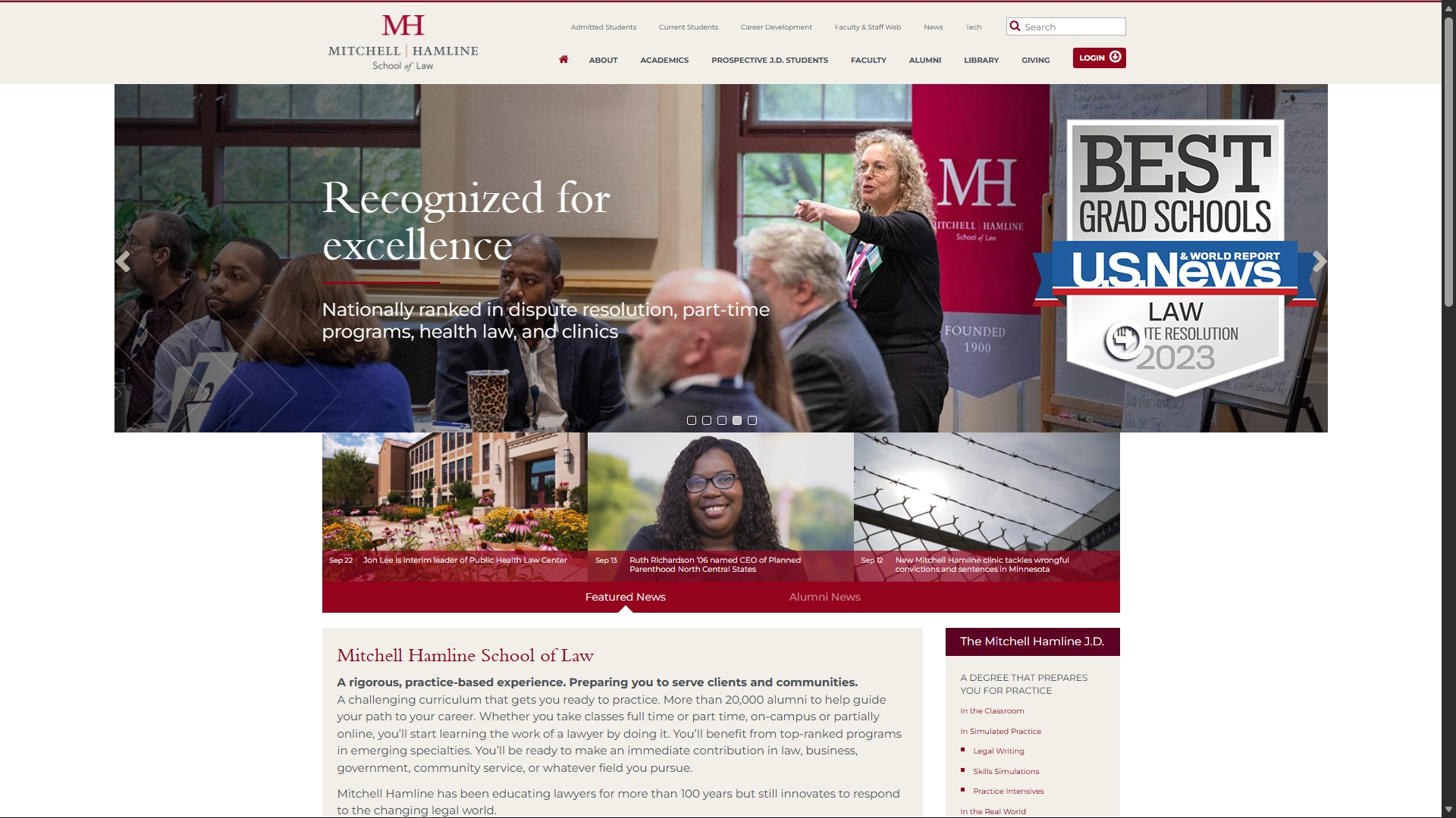
December 2015–October 2022
Where I took it
I spent years looking for a solution created by someone else and talked to my team about it all the time. Finding none, in 2021, I began playing around with a grid system in photoshop. After several iterations and a lot of CSS and PHP, in 2022, I came up with this redesign. I put an interrupter-marquee at the top of the original page for over a month to solicit feedback on the proposed design. Feedback was overwhelmingly positive. People appreciated the depth of information and visuals. The large tile was always a video or set of videos. The five key messages could now use 16:9 or double that height (8:9) ratios. Each of those could have the image, an overlay with a short label, and a two-part text with color overlay. We could show four news stories at a time compared with three before (with a nearly hidden way to switch to three alumni stories, though there was usually only one alumni story at a time). In this image from later in October of 2022, you see the new design—driven by the content, not a need to fill spaces in a design.
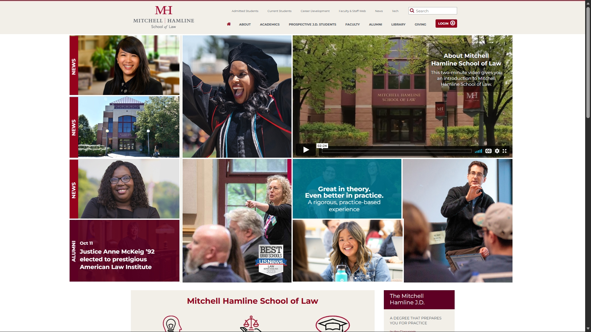
October 2022–February 2026
What happened now?
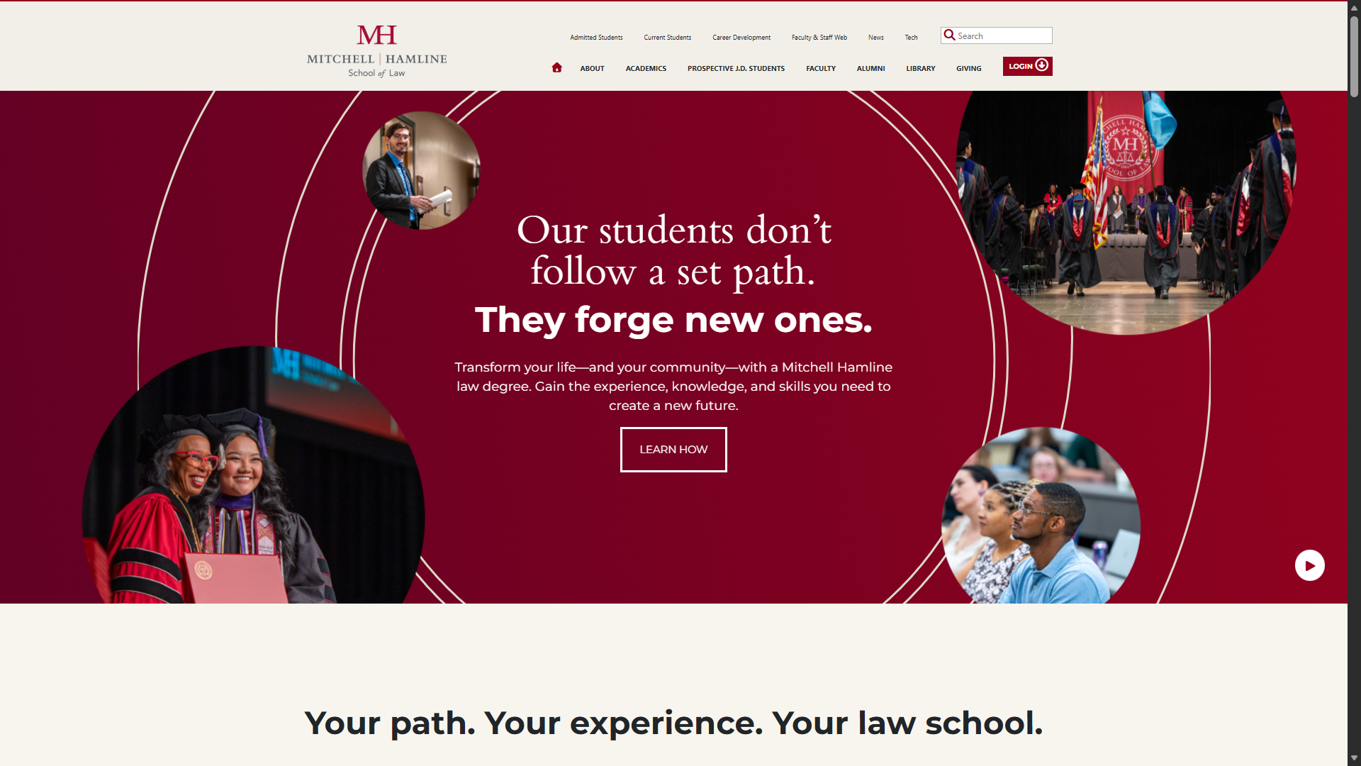
After I left, the national Avoq agency brought back a hero section with circle images of various sizes. When I first encountered it, I spotted that little play button in the bottom right and excitedly clicked it. I laughed out loud when I clicked the play button and found that it made the all-important circle images simply go into orbit or, as a former colleague still on the inside called it, “circle the drain.” They turned the homepage into a landing page. Landing pages are designed for captive audiences from various email or ad campaigns. They aren’t the same thing as a homepage. A home page is like the entrance of your building. It’s a place to be welcomed and find your way. Web pages need to work for the person visiting for the first time and the person visiting for the hundredth time. Because this is just a landing page, this page fails for the latter and for the former if they aren’t a prospective student. Using a landing page as the home page drags us back to the 90s and early 2000s when we had to sit through a flash animation before getting to what the site had to offer.
February 2026–
Missing from “above the fold” on this new homepage
- the sense of a vibrant campus community
- a connection with the alumni community
- thoughtful introductions to the school’s strengths presented in parallel or hierarchy
It’s flat and linear.
Always ask why
Whichever side of a homepage design process you find yourself on, ask why.
- Ask designers why they want to do what their design does.
- Ask stakeholders why they want a specific design or style.
- Ask what the visitors need to do on the homepage, and why this design helps or hurts.
Higher ed institutions have dozens of departments, hundreds of competing interests, and thousands of visits every hour. Every person and department wants that prime real estate. I spent decades finding that proper balance—refining it when times, programs, priorities, and needs changed—and ensuring the homepage served its vital function. It’s disappointing to see that lost.
More Bogie thoughts
« Pronouncing Mahtomedi, Monticello, and Montevideo in the home of 3M Guess Who’s Turning 250 »