I was a ten-year old hockey player when the greatest Winter Olympics ever happened in 1980. So, this is my favorite quadrennial event.
First thing that struck me this year was the super cool duo-tone icons Peacock created for their TV app.
Look at these beauties!
Sorted from favorite to least favorite. After hockey, it’s curling and skiing around shooting stuff for me. I loved the bobsled and luge back in 1980, but my tastes have changed somewhat. I miss ski flying, which was ski jumping, but to the extreme. They discontinued it after a couple jumpers went into orbit. Now, I really like the snowboard roller-derby race down the mountain.
-

- Hockey

-

- Curling

-

- Biathlon

-

- Bobsled

-

- Luge

-

- Skeleton

-

- Ski Jumping

-

- Downhill Skiing

-

- Snowboarding

-

- Skiing Upside-Down

-

- Speed Skating

-

- Chasing Each Other on Skates

-
- Nordic Combined

-

- Cross-Country Skiing

-

- Uphill Skiing

-

- Figure Skating

Resplendent!
Then there’s the official app. It gets its most important function exactly right. The event calendar loads with in-progress events scroll down to see the future, up to see completed events. Perfect. Once you click on an event, you can click on the country flag to see the roster for that team or click the athlete in individual sports. You don’t get a ton of info on the athlete pages, but you get hometown and the athlete’s social links.
Bogie Thoughts on design at the Winter Olympics https://t.co/pV7ofcbmos pic.twitter.com/Lgnl2ZQPq1
— Terrence Bogie (@BogieBWCA) February 14, 2026
Side note: If you have a ten-dollar bill handy, check it out. The most beautiful of our current currency, I have a spread of them as my phone background.
Insert sad trombone failure tune here
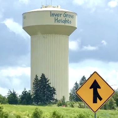
This “26” (Zb, UΔ, 2G?), on the other hand, might be the handy work of the infamous Inver Grove Heiqhts water-tower designer.
-
- Zb

-

- Inver Grove Heiqhts
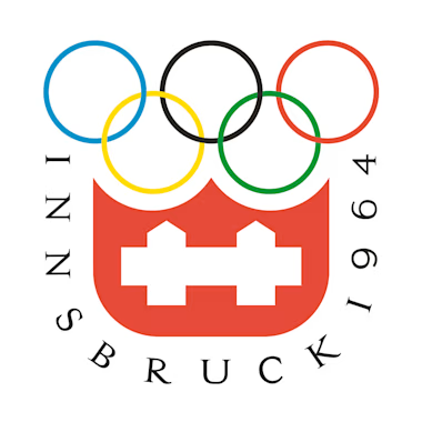
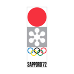
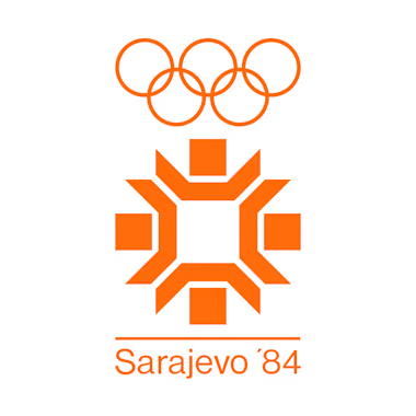
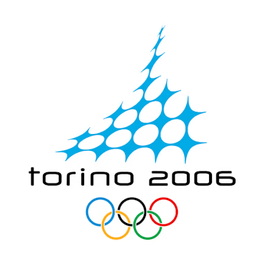
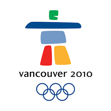
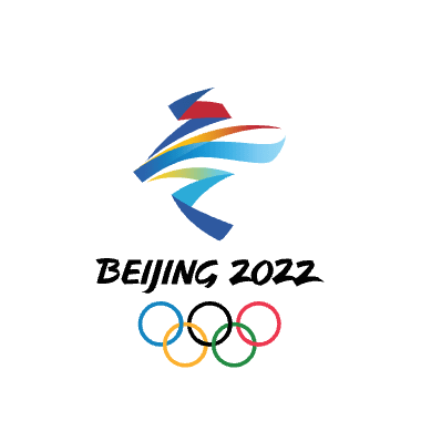
The bad 26, being the primary logo for the games, is prominent and ubiquitous. The games kicked off with curling. On every throw, the rocks slide past this logo living large on the ice. It stands out among the worst in this set along with Sochi and PyeongChang. Squaw Valley ’60 is cool. I can almost smell an envelope and letterhead with that stamped on ’em. Sapporo ’72 is sooo ’70s. We had those things all over the bottom of our bathtub. Innsbruck ’76 is an uninspired disappointment. Sarajevo, Calgary, and PyeongChang forgot how many sides a snowflake has, and I get what Vancouver was going for, but that rock man needs to look a little more athletic like Beijing. It’s abstract, but you can see a skater or skier in there.
-
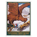
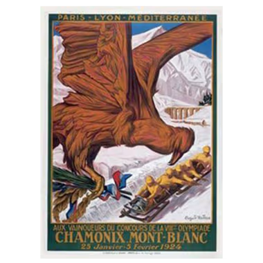
- Chamonix 1924
-
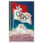
- St. Moritz 1928

-
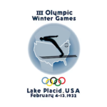
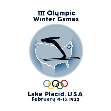
- Lake Placid 1932
-
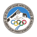
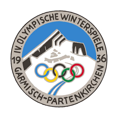
- Garmisch-Partenkirchen 1936
-
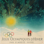
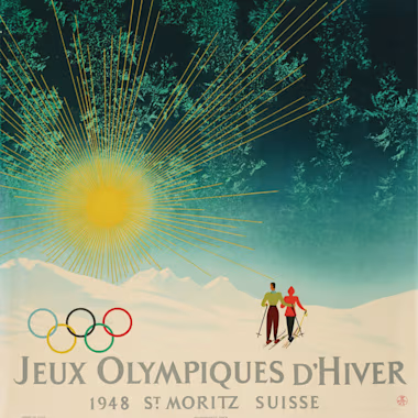
- St Moritz 1948
-
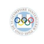
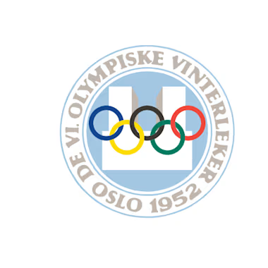
- Oslo 1952
-
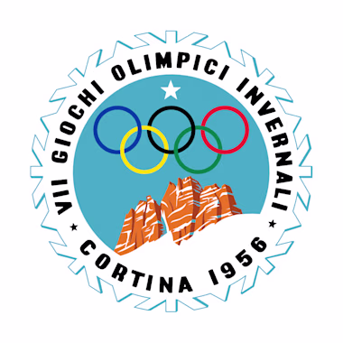
- Cortina d’Ampezzo 1956
-
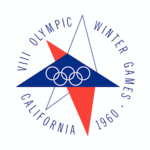
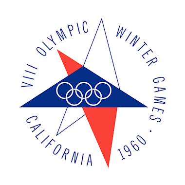
- Squaw Valley 1960
-

- Innsbruck 1964
-
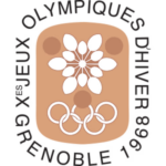
- Grenoble 1964
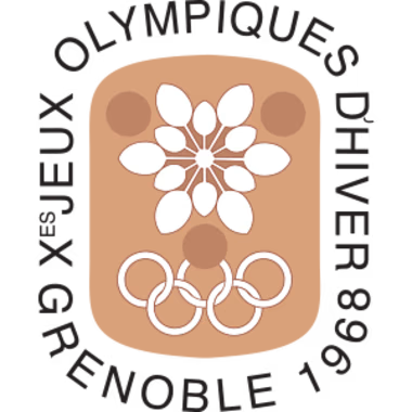
-
- Grenoble 1964

-
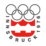
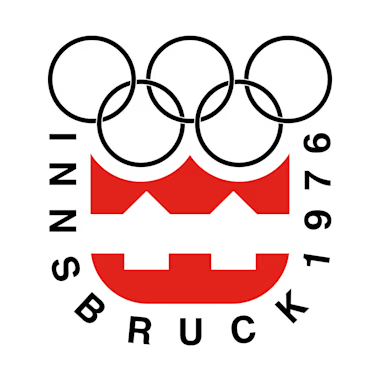
- Innsbruck 1976
-
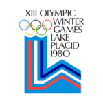
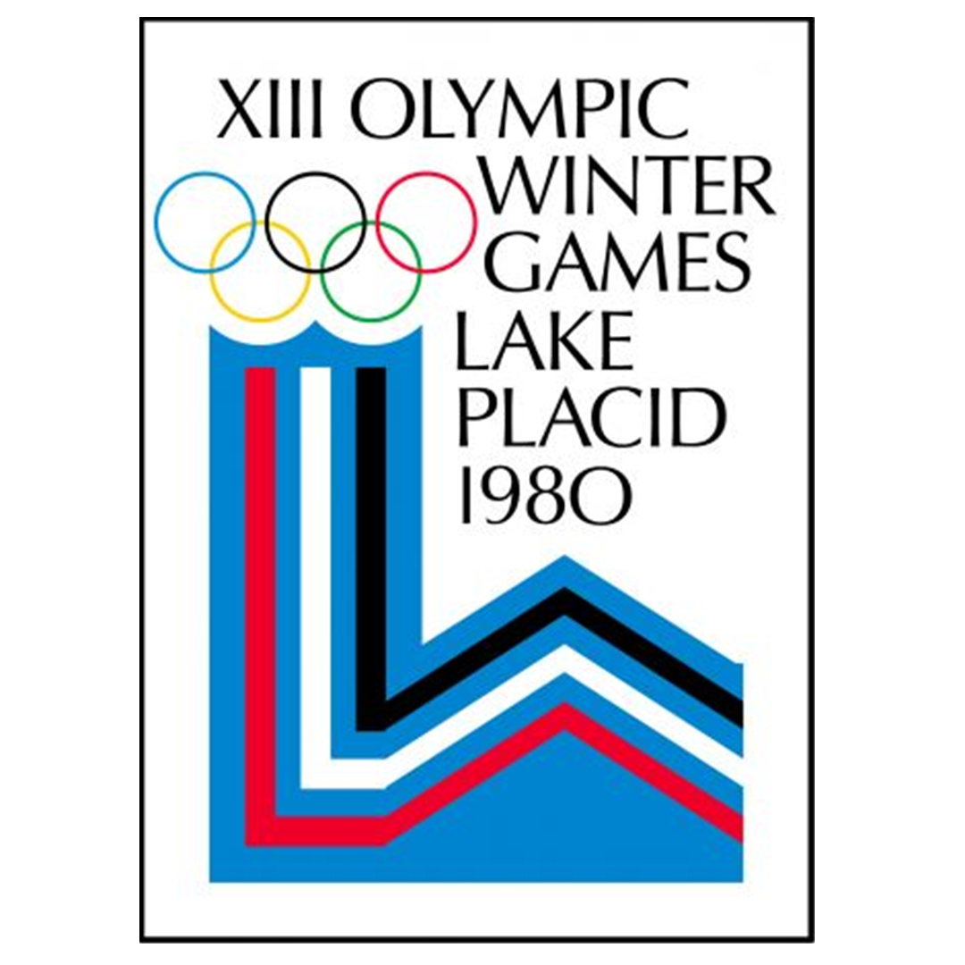
- Lake Placid 1980

-
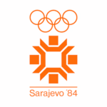
- Sarajevo 1984
-
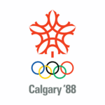
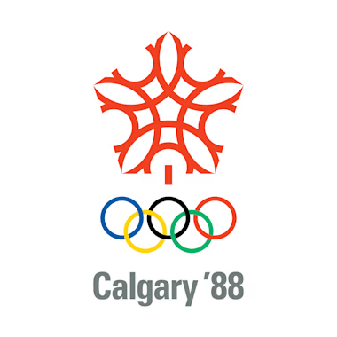
- Calgary 1988
-
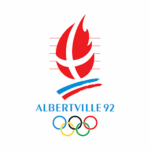
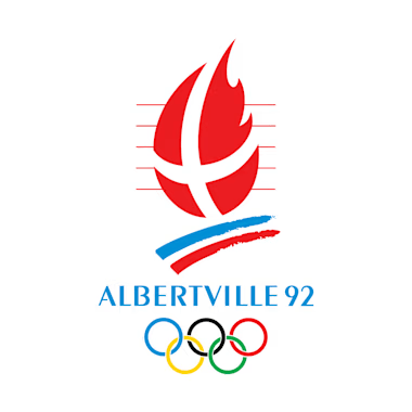
- Albertville 1992
-

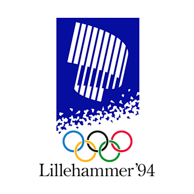
- Lillehammer 1994
-

- Nagano 1998
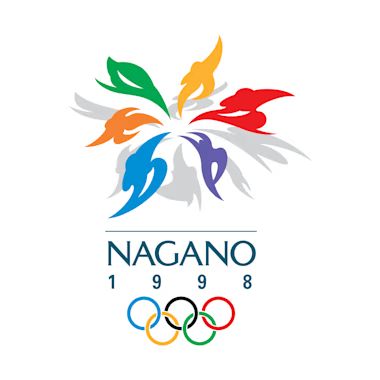
-
- Nagano 1998
-
- Nagano 1998
-

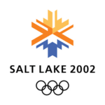
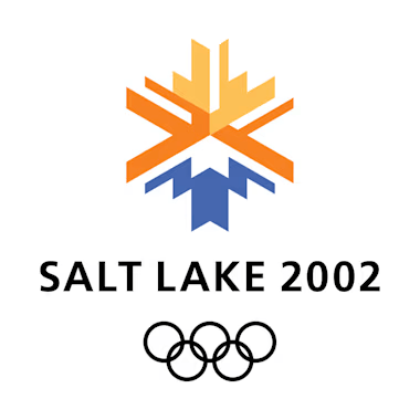
- Vancouver 2010
-
- Sochi 2014
-
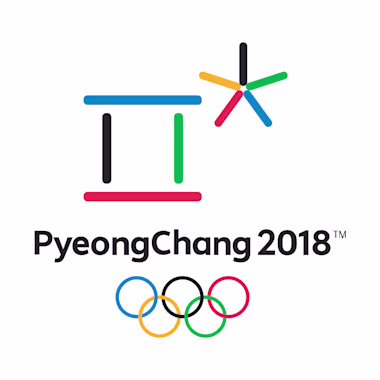
- PyeongChang 2018
-
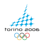
- Beijing 2022
-
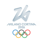
- Milano Cortina 2026

The environmental design and branding have been very nice with the Aurora Borealis look on the hockey boards and dividing walls in other venues. And the way the biathlon course is nestled into the mountains is idyllic.
-
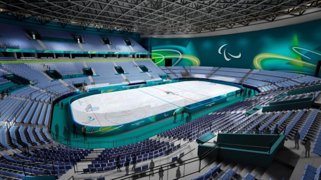
- One of the hockey arenas with the aurora look and hockey nets from a 1980s Target birthday cake

It took me a while to solve the 26 riddle. By comparison to the Peacock sport icons above, the official Milano Cortina icons definitely look like part of a set with the weak 26.
-
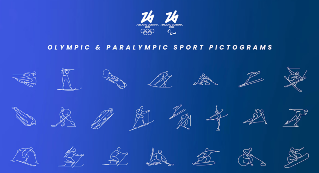
- These icons are just too subtle for me
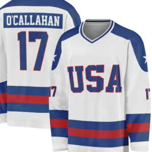
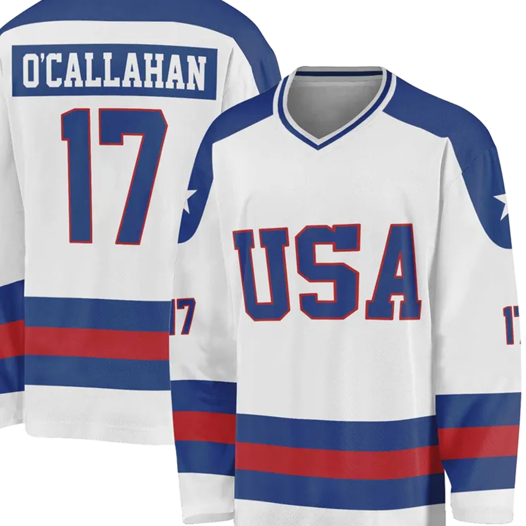
Once again, we have a winner in Lake Placid.
-
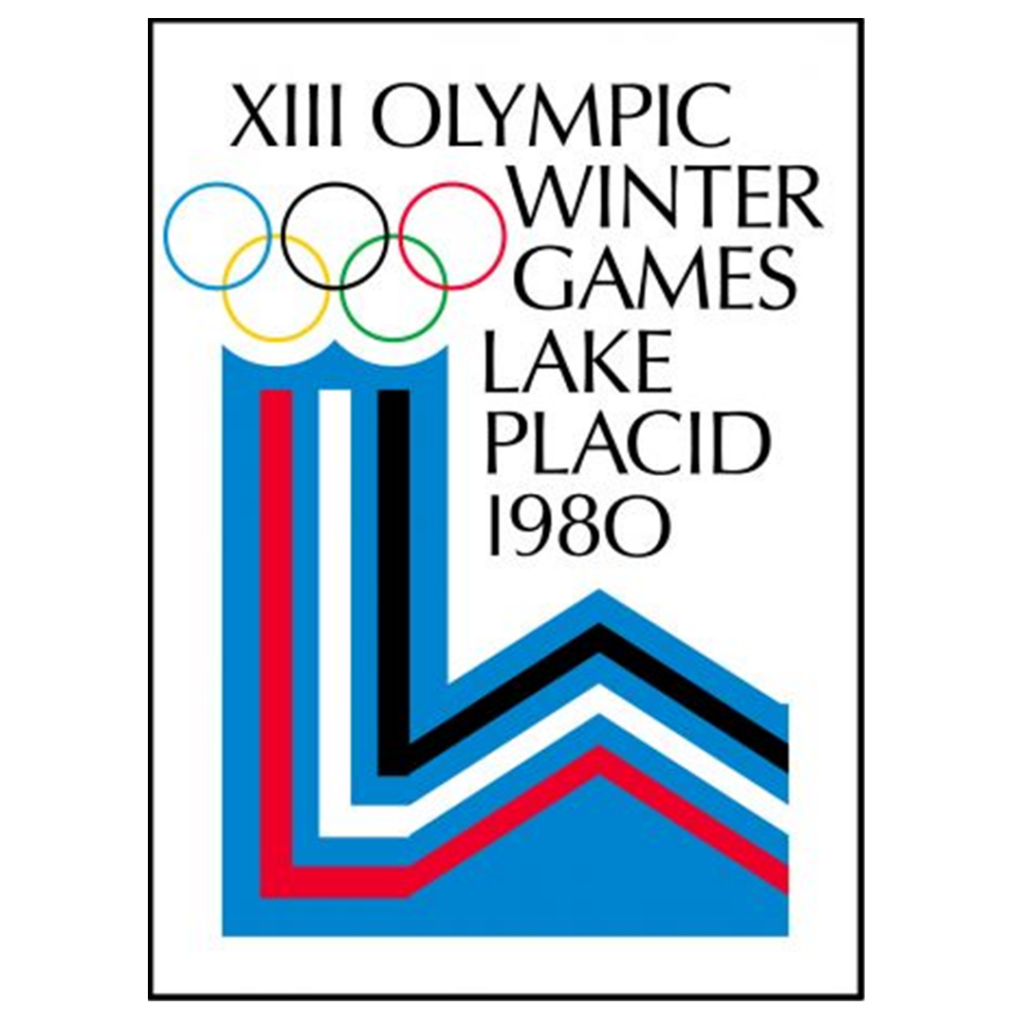
- Take a moment. Go ahead and put on Miracle before continuing this article. I understand.
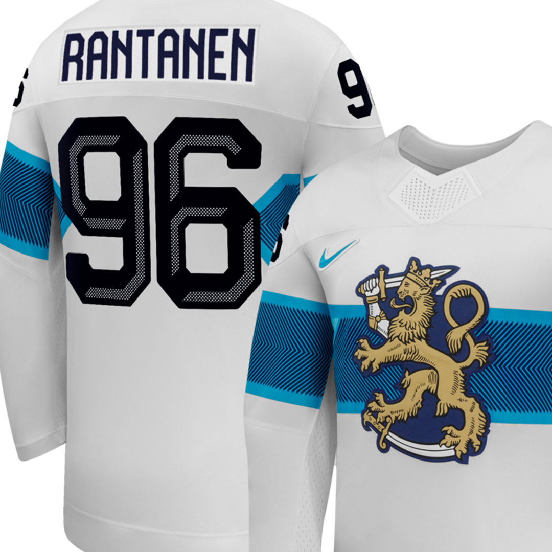
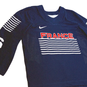
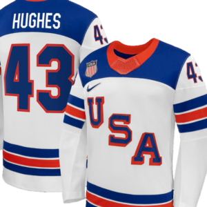
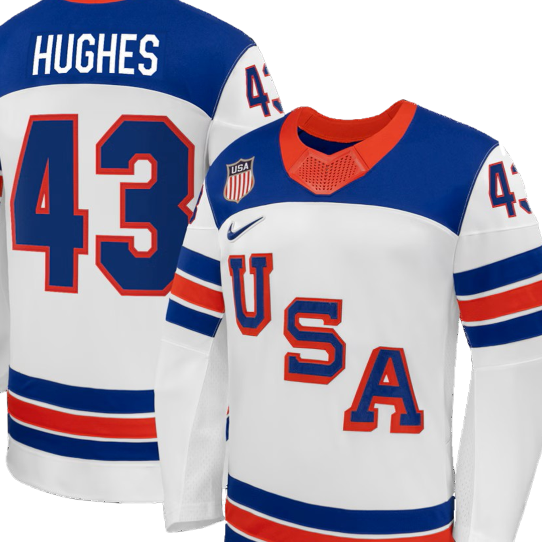
Two extremes in hockey-jersey design
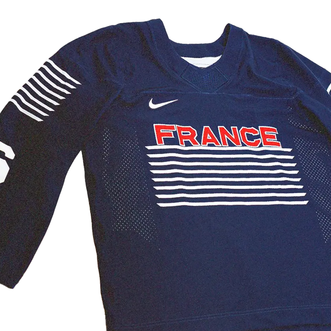
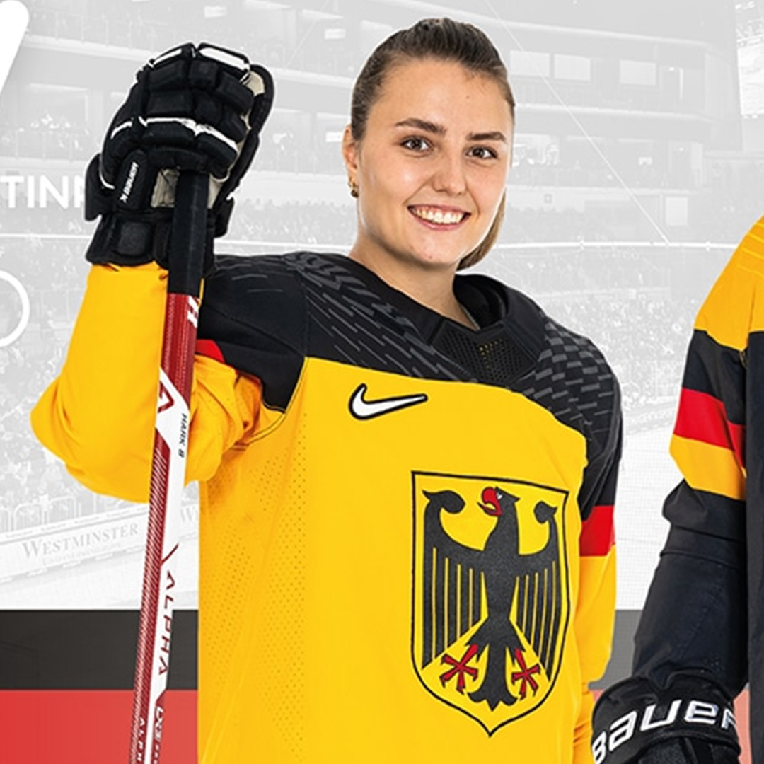
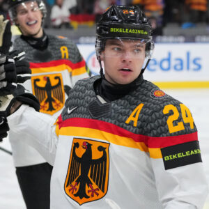
Finland looks great. France? Eek. Germany’s yellows are a downgrade from the previous whites.
-
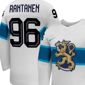
- Best jersey of this Olympics. Just the right level of detail in the lion and interesting texture on the blue band.
-
- I love the big bar codes at Aldi. They keep the lines moving and make self-checkout easy.
-

- The new yellow jerseys are an ugly dud.
-
- The white jerseys of recent years are way better, especially when they had repeating eagles on the shoulders instead of these shapes

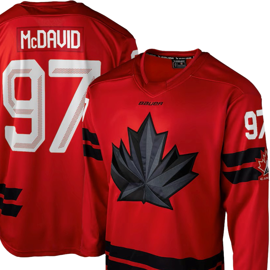
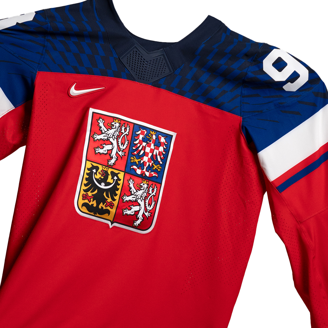
Meanwhile, Canada and Czechia have stepped up their look since the World Juniors in December-January.
-
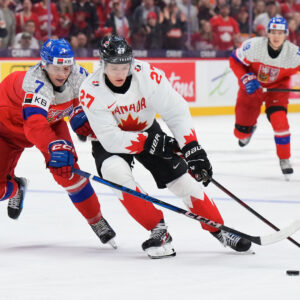
- This game was hard to watch between Canada’s stupid socks and Czechia’s bubble-wrap shoulders.

-
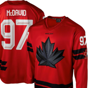
- Not Canada’s best, but the maple leaf socks are gone
-
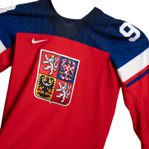
- Boring, but better for Czechia as well
-
- The one that defined the brand
-
- A worthy, modern interpretation
Explainer videos
The official Olympic site wins this battle. Before the Olympics, I watched the explainer on Peacock and it was bad. I can’t find it now. They must have gotten some feedback and reconsidered.
See video here: https://www.youtube.com/watch?v=r_uGg8mFVjsBut finally …
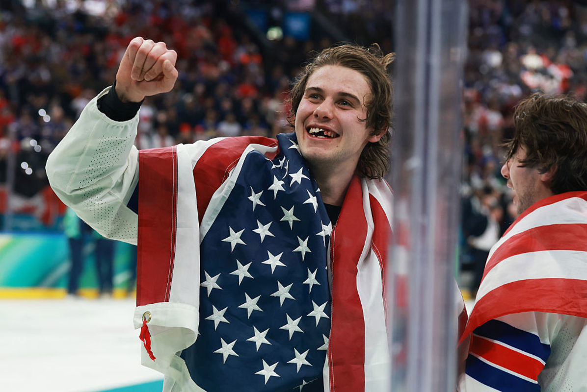
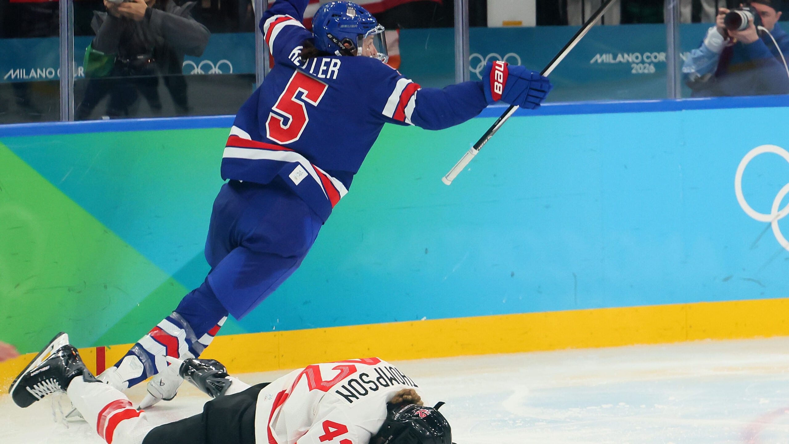
The finest art of the Olympics is in the moments created by the athletes.
-
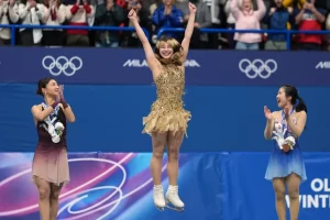
- Alysa Liu, gold

-
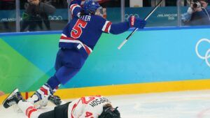
- Megan Keller, gold
-
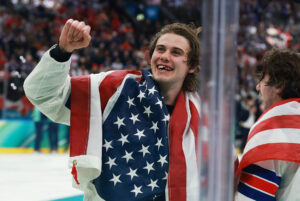
- Jack Hughes, gold